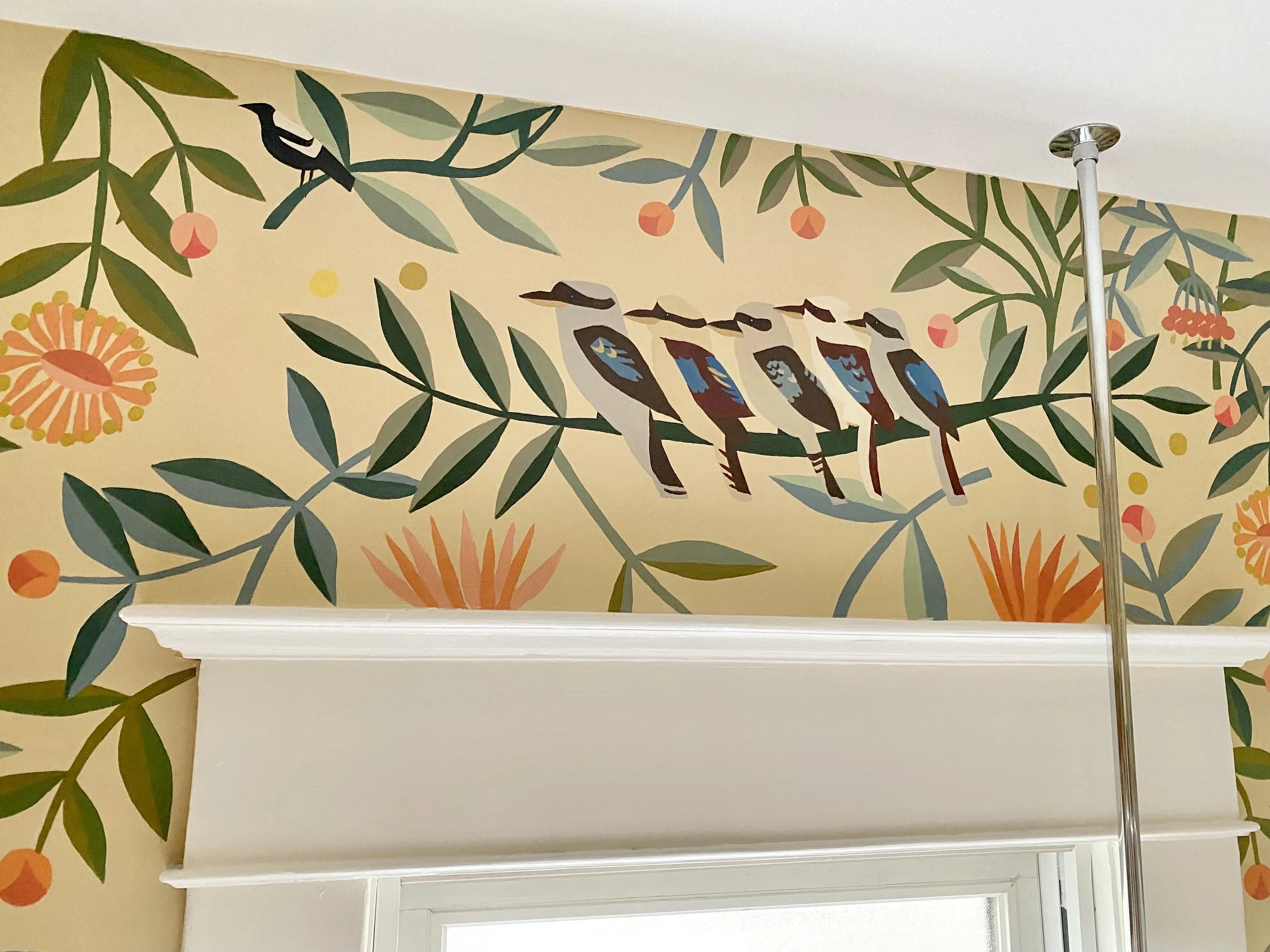
How we Designed our Mural
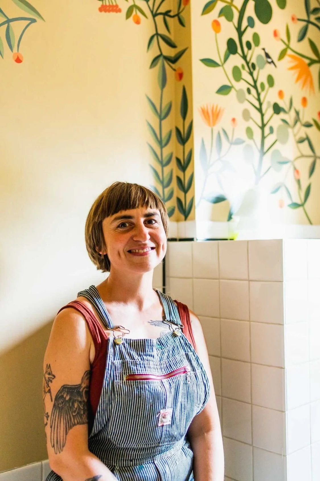
Lettie and the almost finished mural. Photo by Josh Chang.
We hired artist Lettie Jane Rennekamp to paint a mural in our downstairs bathroom as part of a ‘mini’ remodel (that’s in quotes because nothing was as mini as I thought it would be).
Lettie is the genius local artist who was secretly hiding behind the neighbor’s fence at our wedding and surprised us with a gorgeous painting of our wedding dinner.
When we reached out to Lettie we had a vague idea of what we wanted in a mural, but I could never have pictured the finished result from the start of the process. I thought it would be fun to share the process of designing the mural together, and how we got to where it is today!
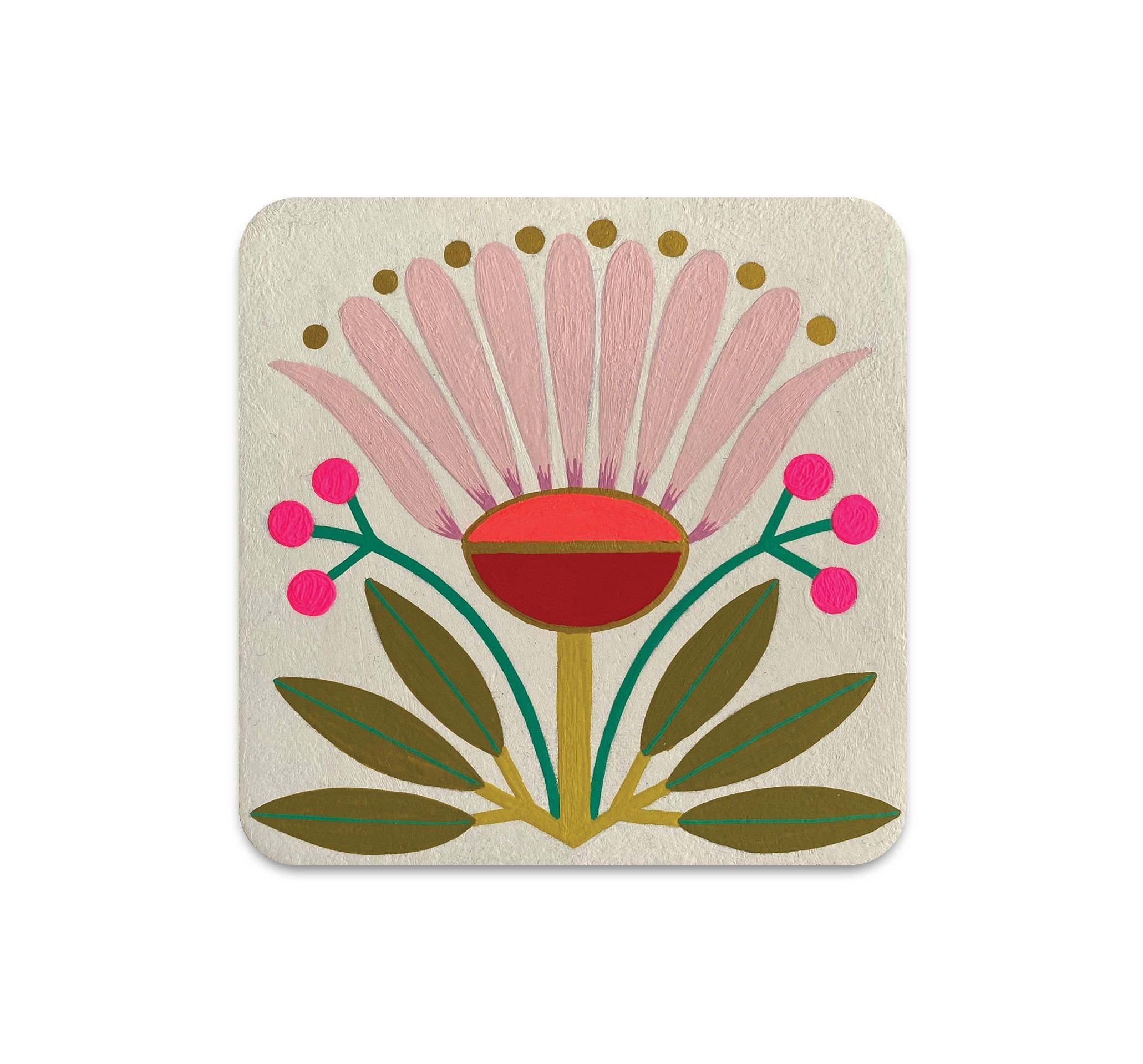
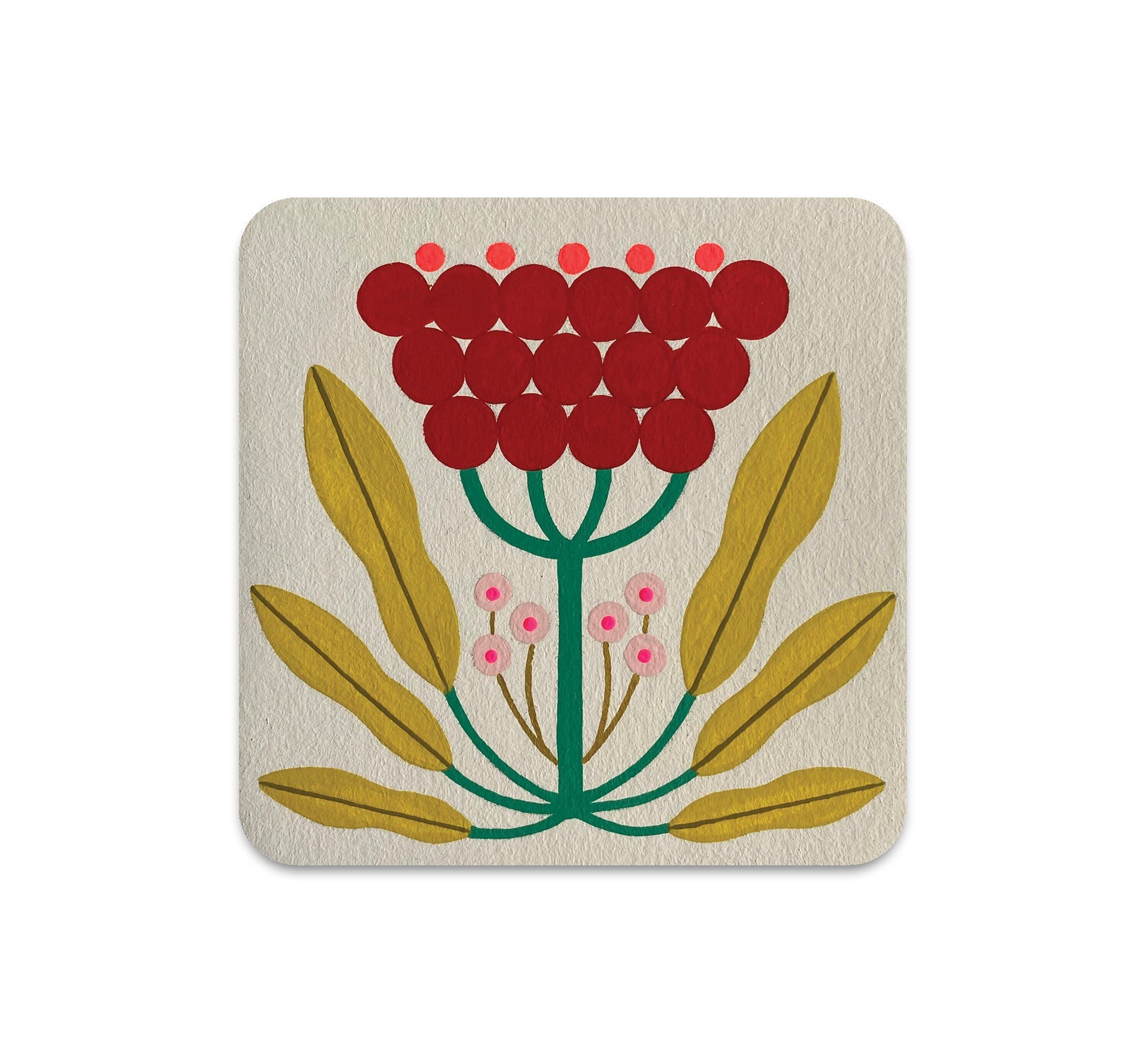
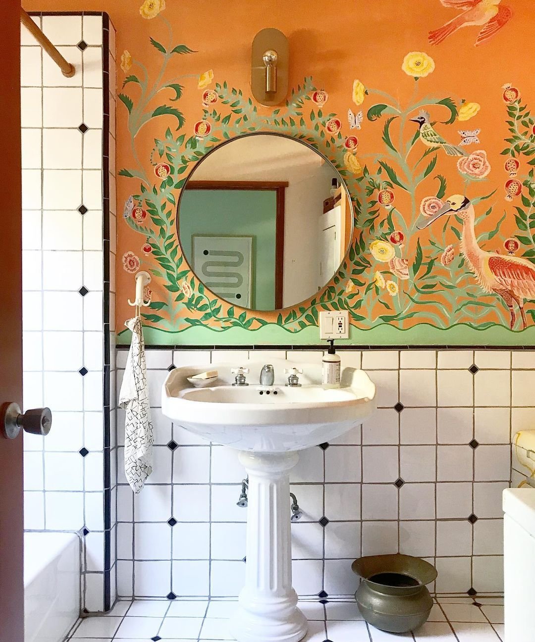
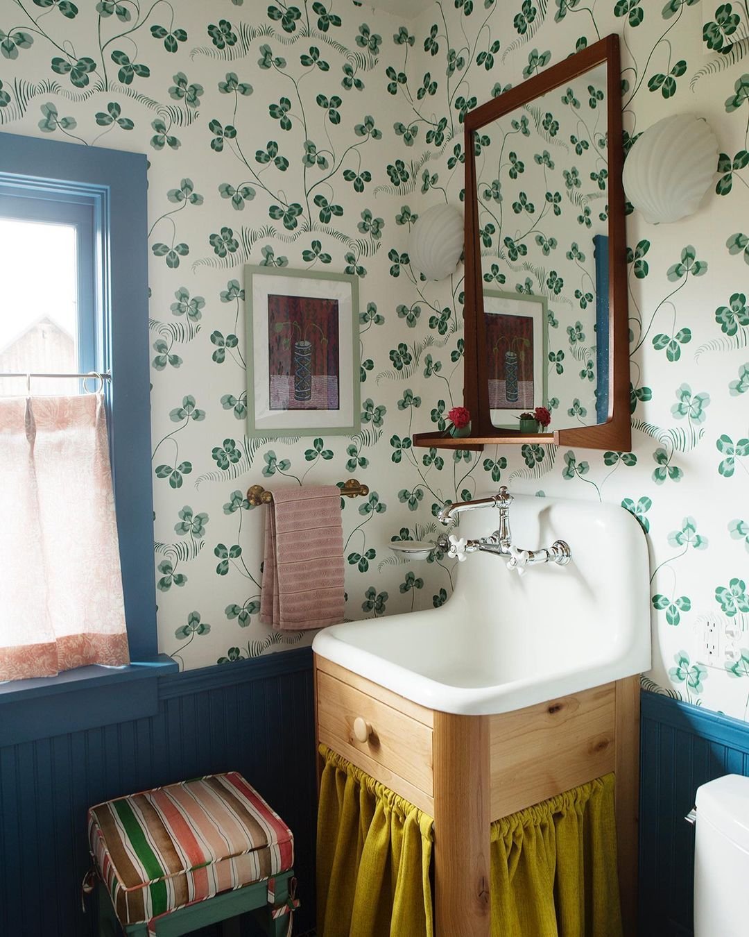
We started with a Pinterest board and a zoom call. These four images were the most influential to me. I loved the green wallpaper so much I almost went in that direction, but decided to hire Lettie instead. The two flowers are by Mary O’Malley, and were in an art show at Nucleus Gallery that Mike was participating in at the time. The mural is a pandemic paint project by Block Shop Textiles cofounder Hopie Stockman. Lettie took all these various points of inspiration and made three mural designs.
We also talked about the idea of incorporating Australian birds and animals that we saw on our trip February of 2020 to make it more personal to us.
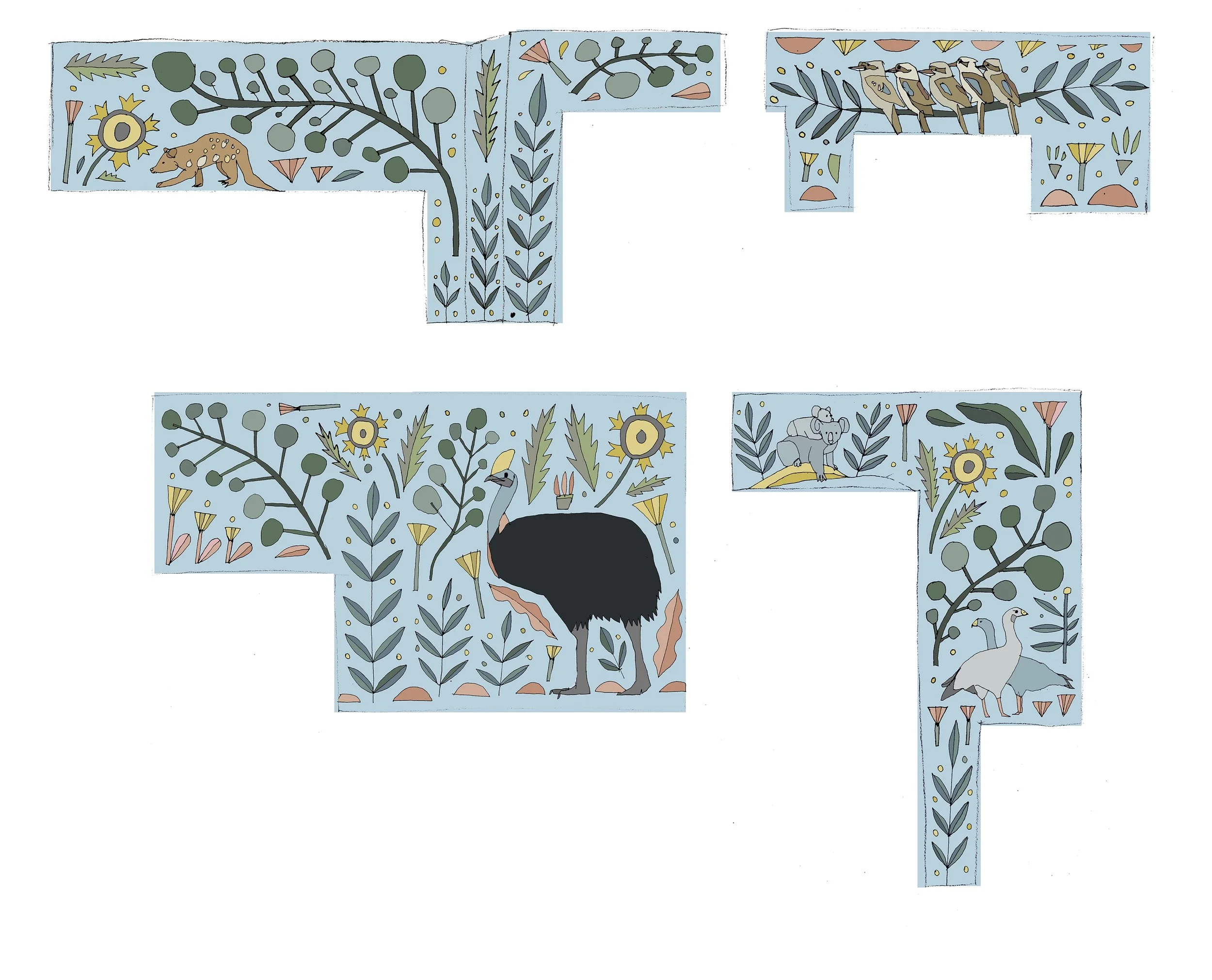
Design 1
This was design 1, and the one we ended up using for the bulk of the mural. You can see Mary’s flowers reinterpreted by Lettie!
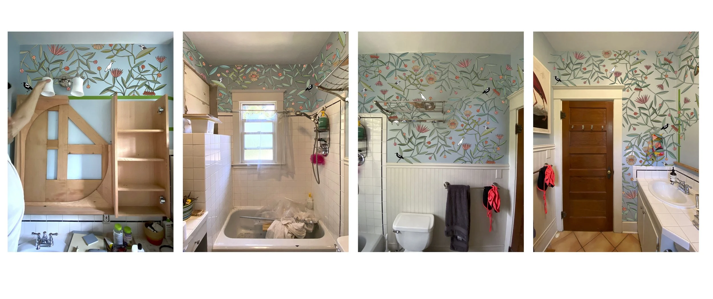
Design 1 Mock-Up
Here it is mocked up using iphone photos of our messy bathroom, including one of a mid-way point in the construction of our gorgeous mirror.
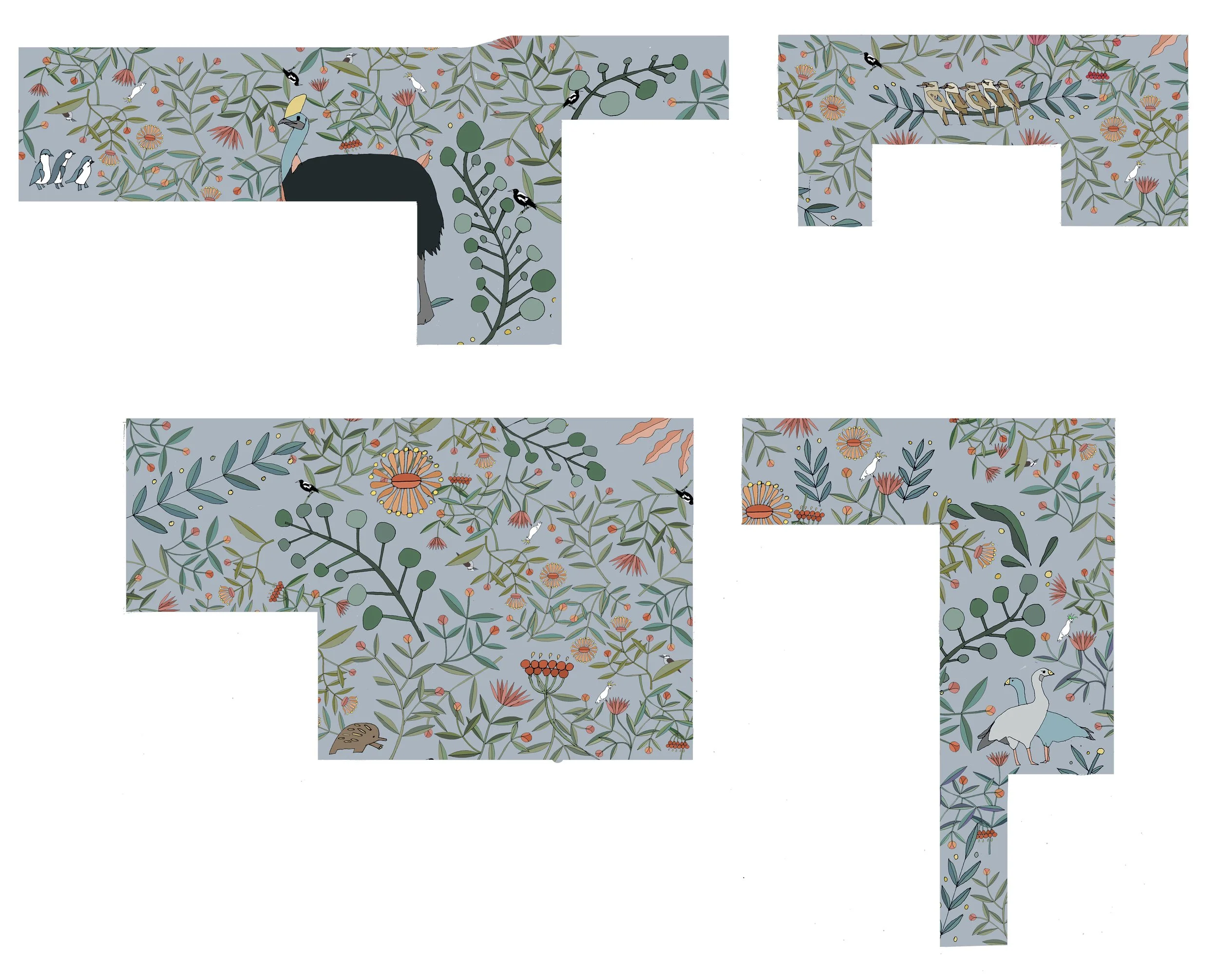
Design 2
This is the second design, and honestly is probably most true to Lettie’s other murals. We just thought it was a little too bold for our space. You can pinch and zoom to see all the fun details, like the penguins and echidna we had to have!
Design 3
And this is the 3rd design. It was the most inspired by Swedish designs, and had the most animals. We ended up pulling animals from this design and merging it with the overall pattern of the first design. We loved the kookaburra sitting on the vine above the window, and we loved the cape barren geese, so we added those to design 1.
Design 1 + 2 + 3
Lettie took our feedback and made a final design. This is nearly the design we ended up using. The cassowary got the cut, and the geese were moved around a little so they wouldn’t be blocked by the hand towel.
Tell me it doesn’t look amazing in Cord?
This is the point where I went rogue - the point where we had to decide what background color to use. The mural had been mocked up on blue until now, assuming we would use a less saturated version of what we already had in the bathroom. But my gut told me that the bathroom was not meant to be blue. I was the only vote for the Farrow & Ball pain color ‘Cord’, but my vote outweighed everyone else, and I took the leap and painted the bathroom ambiguous tan.
And here we are! Our beautiful mural is all done, and we love it so much! The bathroom is 99% done, and I’ll post some great before and afters once I clean up, add some plants, and hang the shower curtain.
It was a dream come true to work with Lettie, and we are honored to have this gorgeous artwork in our home.
